Worked with
Co-Lead of Milkrun
Head of Growth
Marketing Manager
Brand Designer
External Branding Team
My Role
I owned product design for the brand refresh, from the design audit and competitive analysis to UX and UI redesign and the app design system, with every decision grounded in data.
Duration
Part of F26 Strategy
May - Aug
Problem
Following its acquisition by Woolworths, MILKRUN lost its sense of identity. Its core benefit, fast delivery, was no longer unique, as competitors and Woolworths’ own offerings closed the gap. The brand needed a clear position, and the app needed to make shopping simpler for users. To differentiate, the brand pivoted to an "Easy Peasy" positioning, which required a full brand refresh. Simultaneously, Milkrun prepared to integrate the acquired Jimmy Brings liquor brand into its ecosystem.
Challenge
Turn “Easy Peasy” into a brand that users can recognise in the app, while reducing the cognitive load of shopping and improving convenience across digital touchpoints. The scope was limited to the Home page and navigation, and the foundation had to be a design system that could scale beyond this phase.
Impact
The Approach
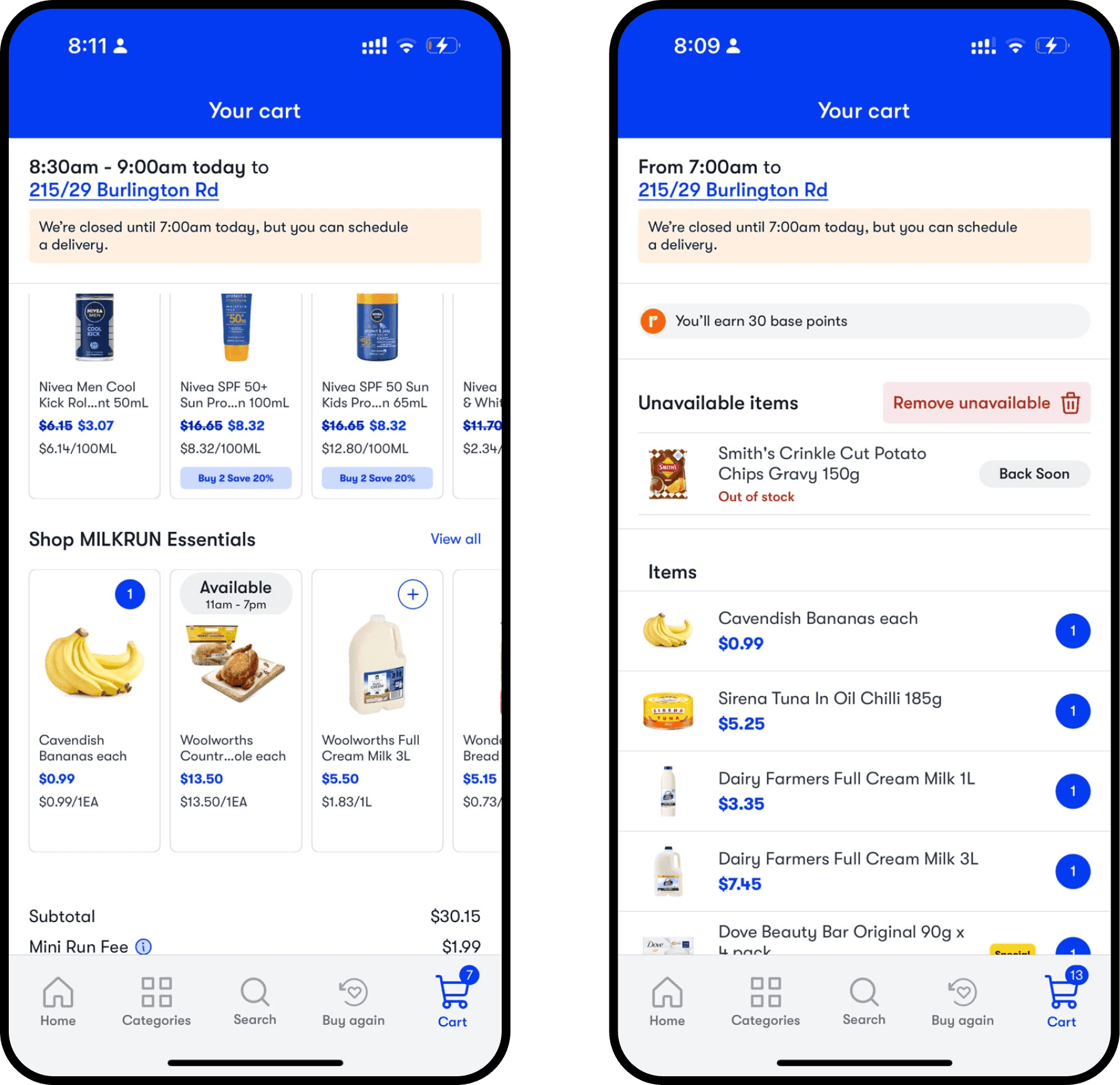
The only brief was to bring the new “Easy Peasy” brand into the app. The strategy was mine. I decided what to research, asked for the numbers I needed, and ran a thematic analysis of the research data I was given. That work defined the problem: navigation was hard, the app overloaded users with too much at once, and accessibility was missing. It also surfaced many ideas for easier navigation and a shorter path to checkout, such as scheduled delivery, an Order Again tab and a “Have You Forgotten?” page, which I added to the roadmap. Order Again and “Have You Forgotten?” later shipped in my AOV project, and scheduled delivery launched after I left.
Convenience is the brand, so every change had to remove effort for customers and move a business metric. With that evidence, I agreed goals, scope, KPIs and phasing with the Head of Growth and Marketing Manager.
Auditing Pain Points: Assessing the Milkrun App before Redesign
The brand had a cheeky, confident voice but no digital guidelines to carry it into the app. Working alongside the branding team, I took on defining them, starting with how people actually used the app day to day.
I ran a design audit and used AI to build a thematic analysis of open-ended survey responses, then validated every pattern myself before treating it as a design input. A condensed version went to the marketing and design teams so decisions were grounded in user data, not assumptions.
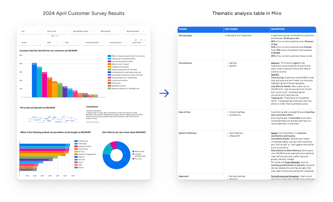
Demographic Insights
Competitive Analysis
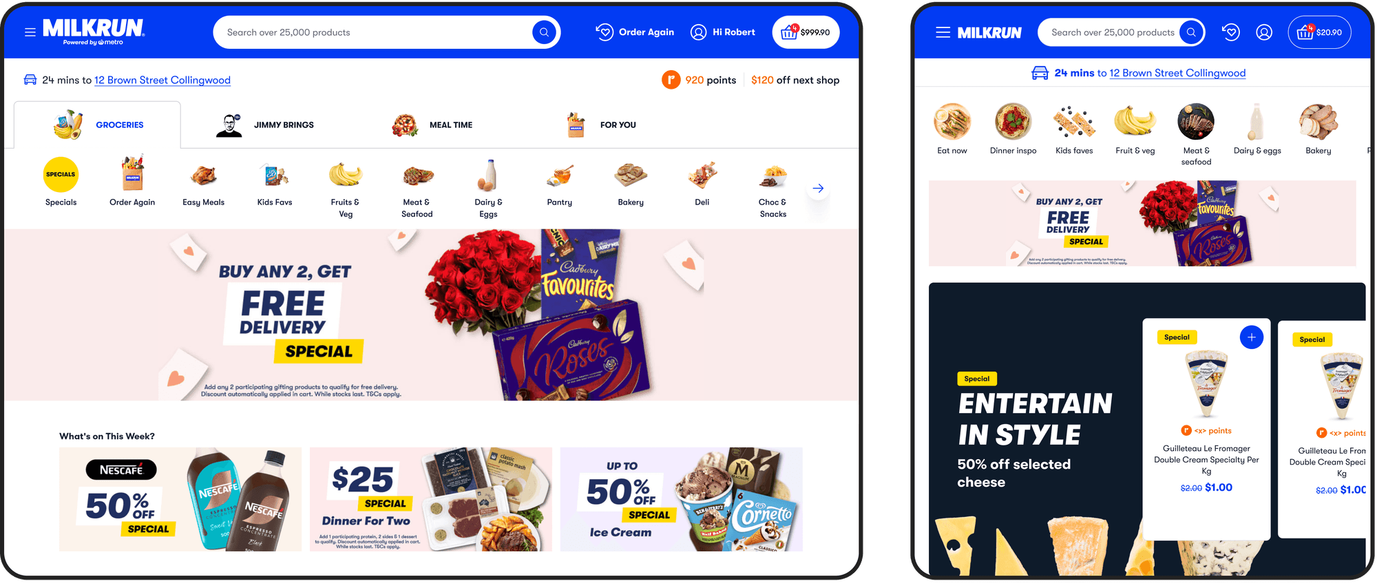
Having never designed a delivery app, I benchmarked Woolworths, Coles, Uber Eats and DoorDash for patterns that reduce cognitive load. I then ran a Figma voting workshop so the team prioritised findings from evidence, and took the results into strategy sessions with marketing to tie the roadmap to growth goals.
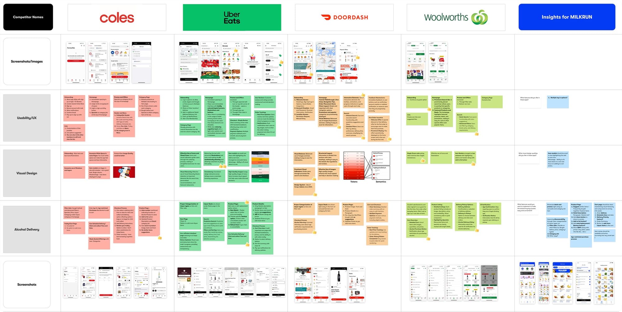
Areas of Improvement & Visualising Opportunities
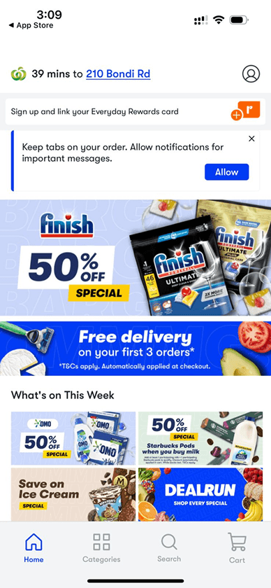
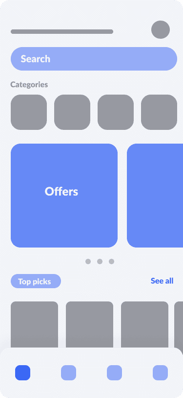
With the navigation, cognitive load, and checkout friction points identified across the competitive analysis mapped out, I moved quickly into low-fidelity wireframes, testing layout, content hierarchy, and copy before committing to any visual design.
What the research told us
Three patterns stood out. Users couldn’t find things, with no header search, dead clicks on the home icon and poor accessibility. The homepage shouted instead of guiding, with blue everywhere and competing banners. And there was no system to carry the brand or new categories like liquor. The three sections below answer each one.
Reducing Cognitive Load on the Home Page
I also considered how each change would support the integration of Jimmy Brings, Milkrun’s liquor delivery, and help increase liquor orders.
1. Make Finding Things Effortless
Search in the header
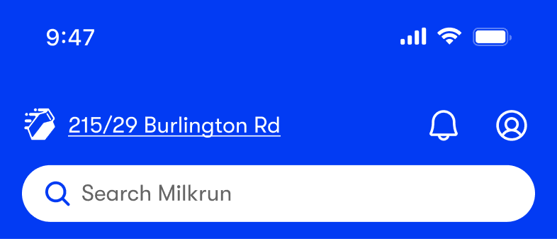
There was no search in the header, so users had to browse categories to find products, which slowed discovery. We wanted more customers to use search, so we added a search bar to the home page.
Requirements
- Introduce a search bar on the homepage
- Introduce a back button on the search bar to help the customer to land on previous screen again
- Add ghost text, search icon and close icon on the search bar
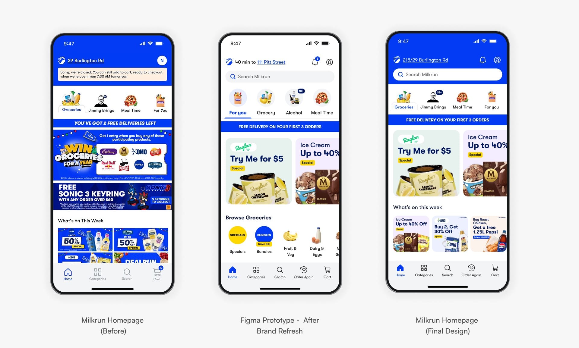
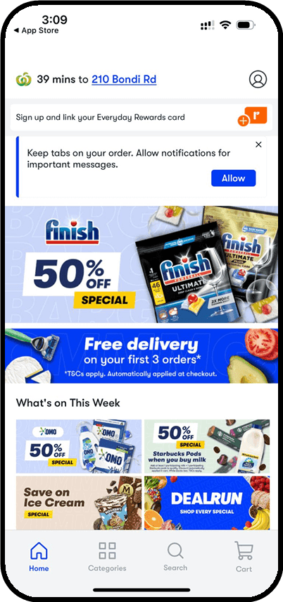
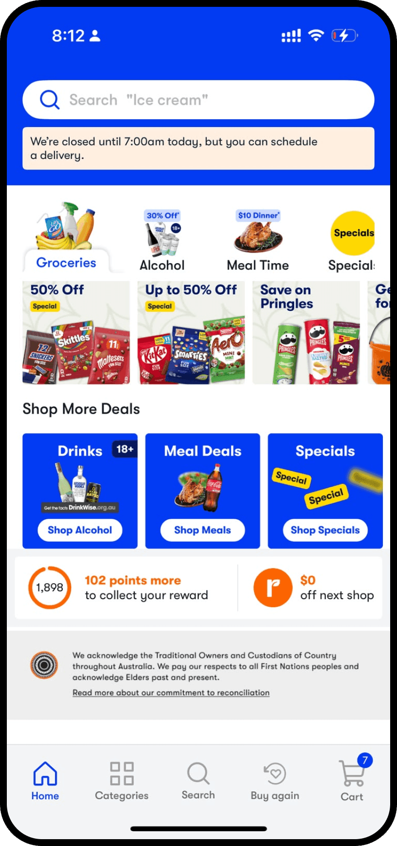
I proposed a white header to reduce visual noise, but the team chose blue to keep the brand colour prominent. I conceded the colour and kept what mattered most: search up top and Everyday Rewards moved below the fold, where it stopped taking prime space.
Fixing the nav bar
FullStory session data showed dead clicks on the home icon in the bottom nav, and users who repeatedly tapped it converted 62.45% lower afterwards. A heuristic evaluation also found confusing navigation and poor accessibility that drove abandonment.
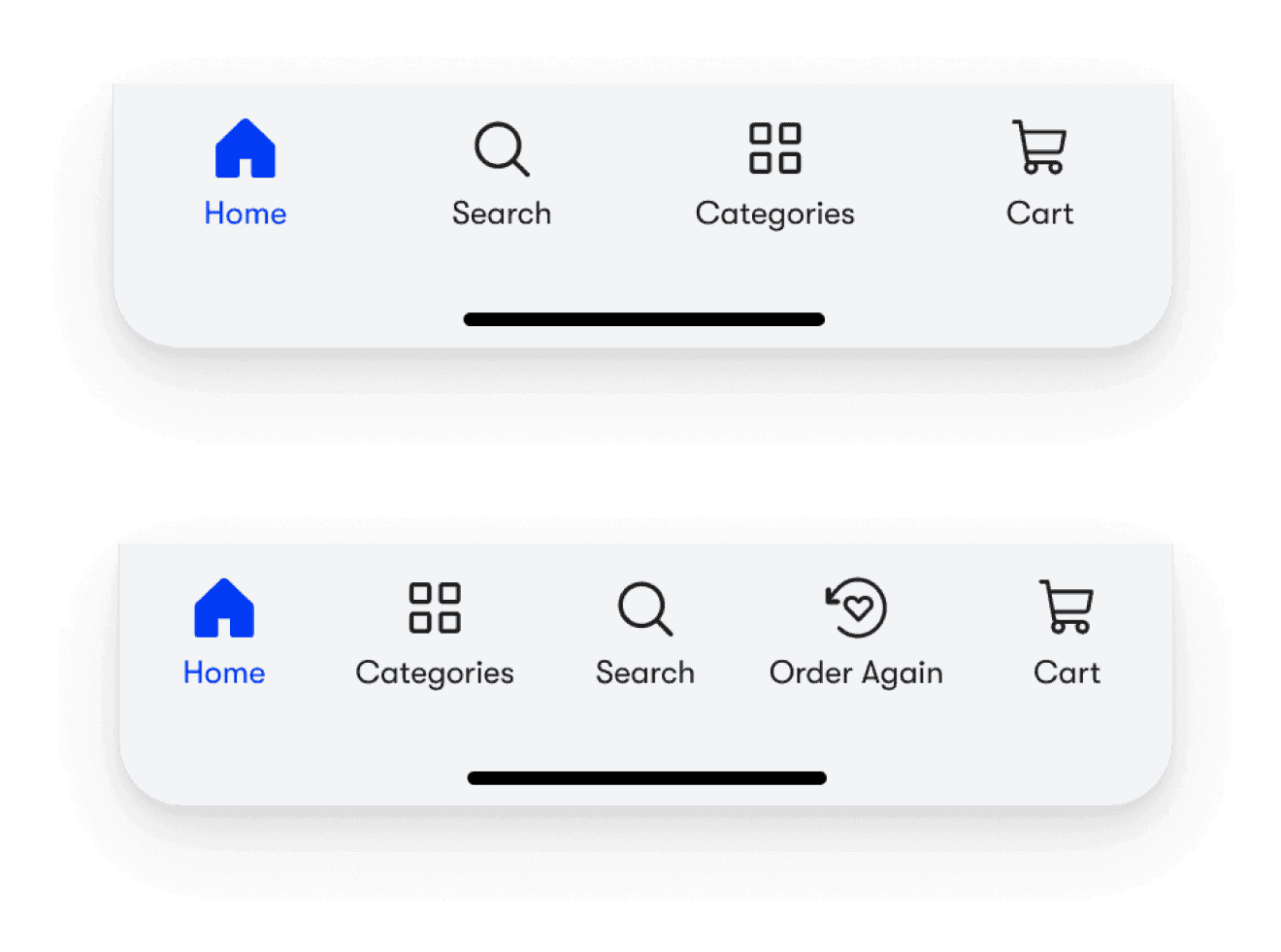
- Solid-fill active states: The bottom navigation now uses solid-fill active states that match standard user expectations, which improves clarity by reinforcing the current page.
- Return to top: Added a return-to-top function that matches standard user expectations, giving a clear action outcome and minimising confusion and unnecessary clicks.
- Accessible contrast: Icons and background in the bottom navigation meet WCAG AA minimum contrast ratios for accessibility.
Solution: Fixing Usability Issues in the Nav Bar. Solid-fill active states, a return-to-top function, and WCAG AA-compliant contrast make the bottom navigation clearer and more accessible.
2. Let the Homepage Guide, Not Shout
Reducing colour overload
Too much blue across banners and promos added visual noise and cognitive load, making it harder for users to spot key actions.
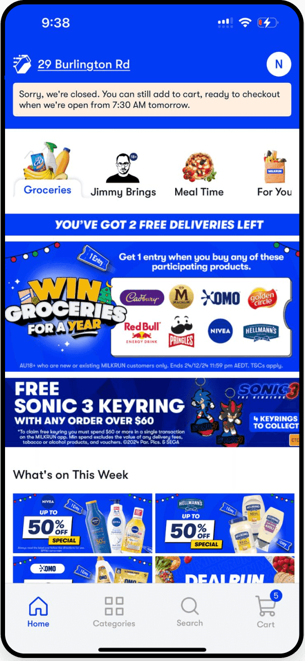
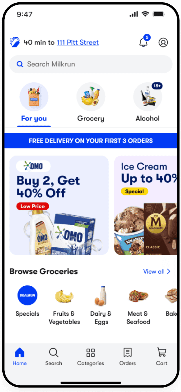
Solution: Reducing Color Overload. Blue is now limited to links, CTAs, and areas where it’s functionally necessary, instead of dominating every background.
Restructuring the homepage
The homepage buried category navigation, so users had to dig through static sections instead of quickly scanning for what they wanted.
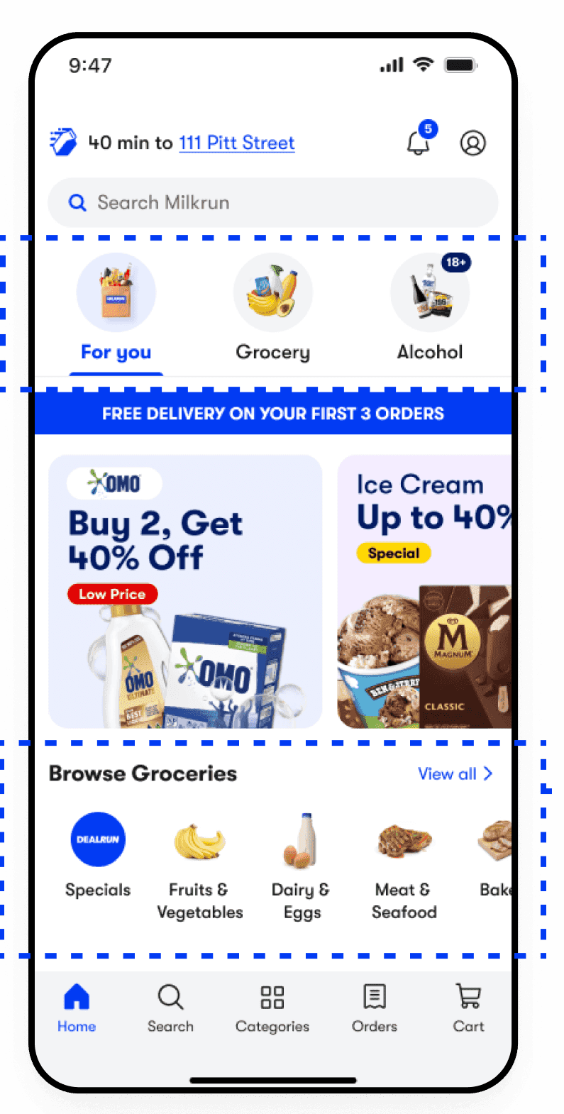
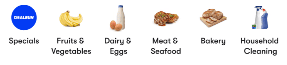
- Categories tab: Incorporated category tabs from the old design with UI modifications. The tabs approach allows for scalability when adding new categories in the future.
- Category carousels: Introduced category carousels on the homepage to increase visibility and help users find products easily without navigating to the respective category pages.
- Fixed offers as a category item: They serve as an entry point with greater visibility, leading to increased user engagement.
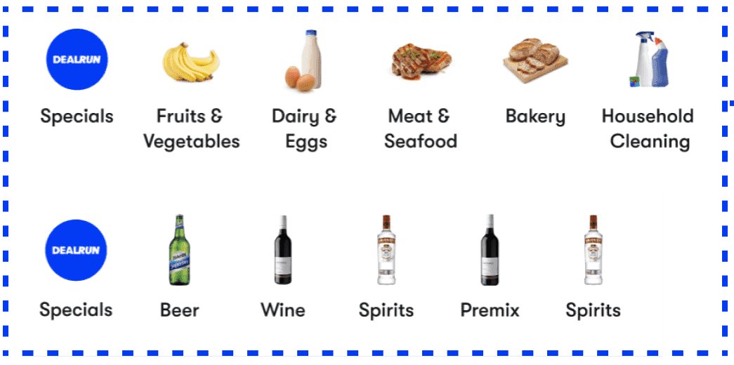
Solution: New Homepage Concept. Category tabs allow scalability, carousels increase visibility, and fixed offers serve as a high-engagement entry point.
The team loved my category carousels, but they meant rebuilding the existing tab structure. I recommended keeping the tabs and swapping in smaller banner carousels, which kept the visibility win and shipped faster.
Carousel banners
Multiple static promotional banners competed for attention simultaneously, overwhelming users instead of guiding them to one offer at a time. The new banners also use a larger corner radius to match the pill-shaped buttons and form fields.

- Carousel banners: Carousel banners maximise limited screen space, presenting multiple offers in a single, compact area, reducing clutter and making the experience feel dynamic. Users see one message at a time, reducing cognitive overload compared to multiple static banners shown at once.
- Pill-shaped buttons: The new design system features pill-shaped buttons, and banners use rounded corners to maintain visual consistency.
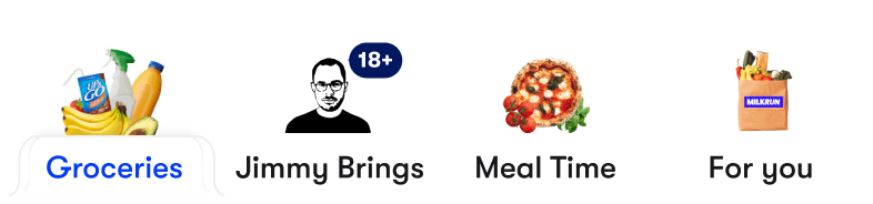
We needed to bring in Jimmy Brings (liquor) and other categories without cluttering the app or losing brand consistency, while giving users different ways in, whether they shop with a plan or just browse.
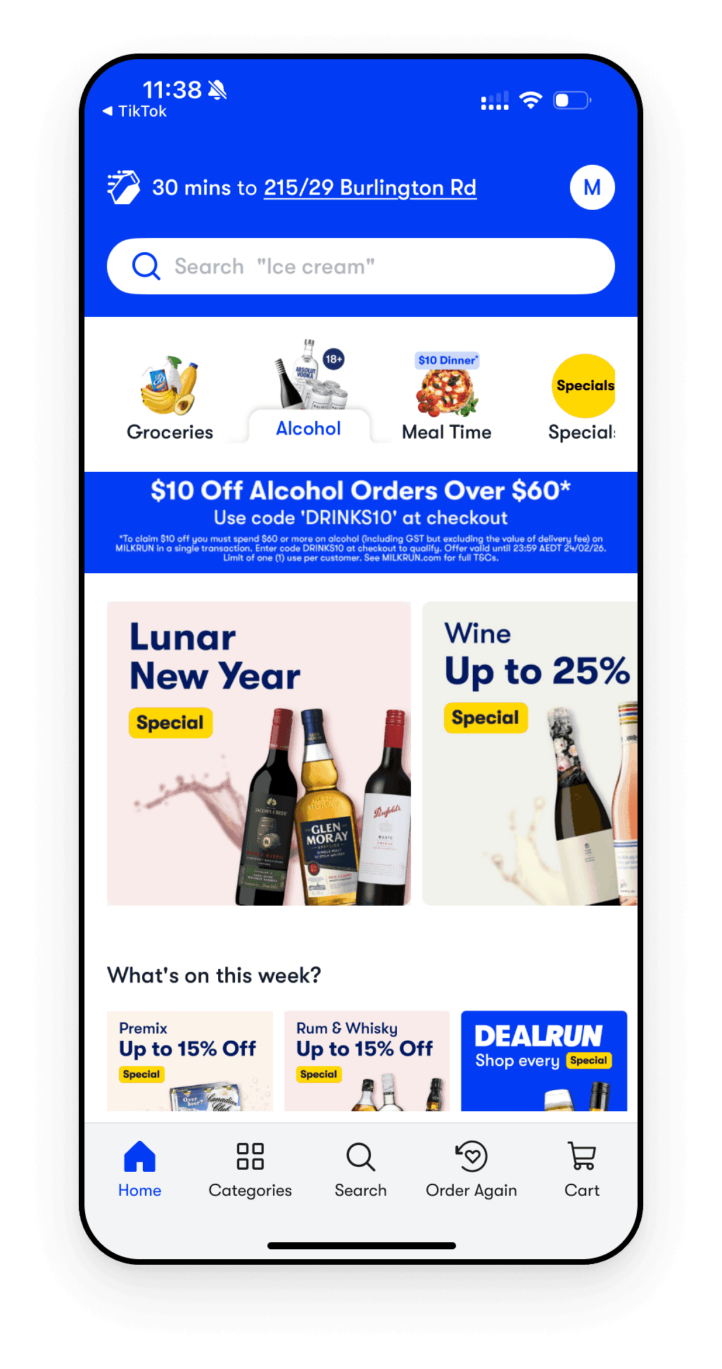
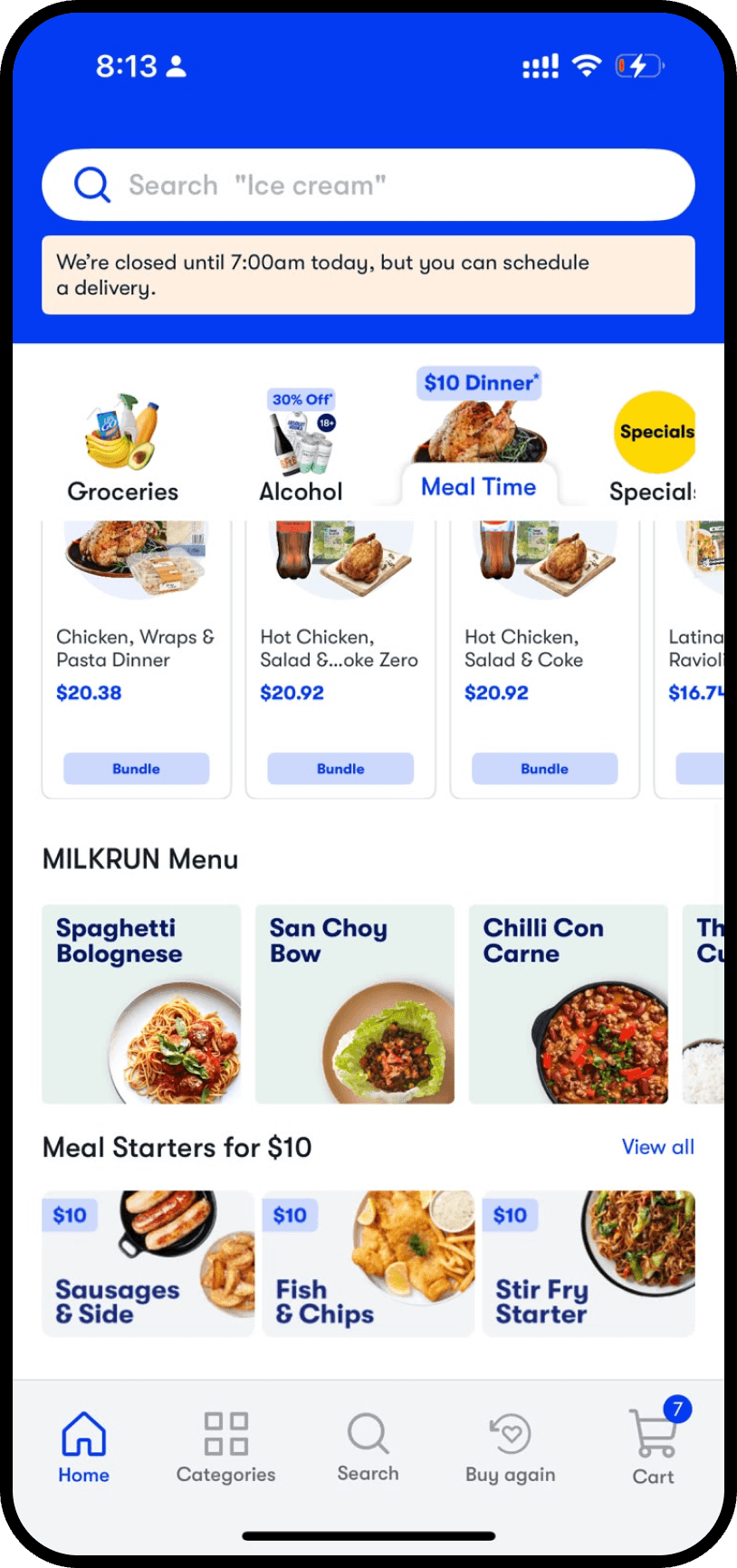
Solution: Banner System. Carousel banners reduce clutter and cognitive overload, and pill-shaped buttons with rounded corners keep the system visually consistent.
3. Building Milkrun's Design System (MDS)
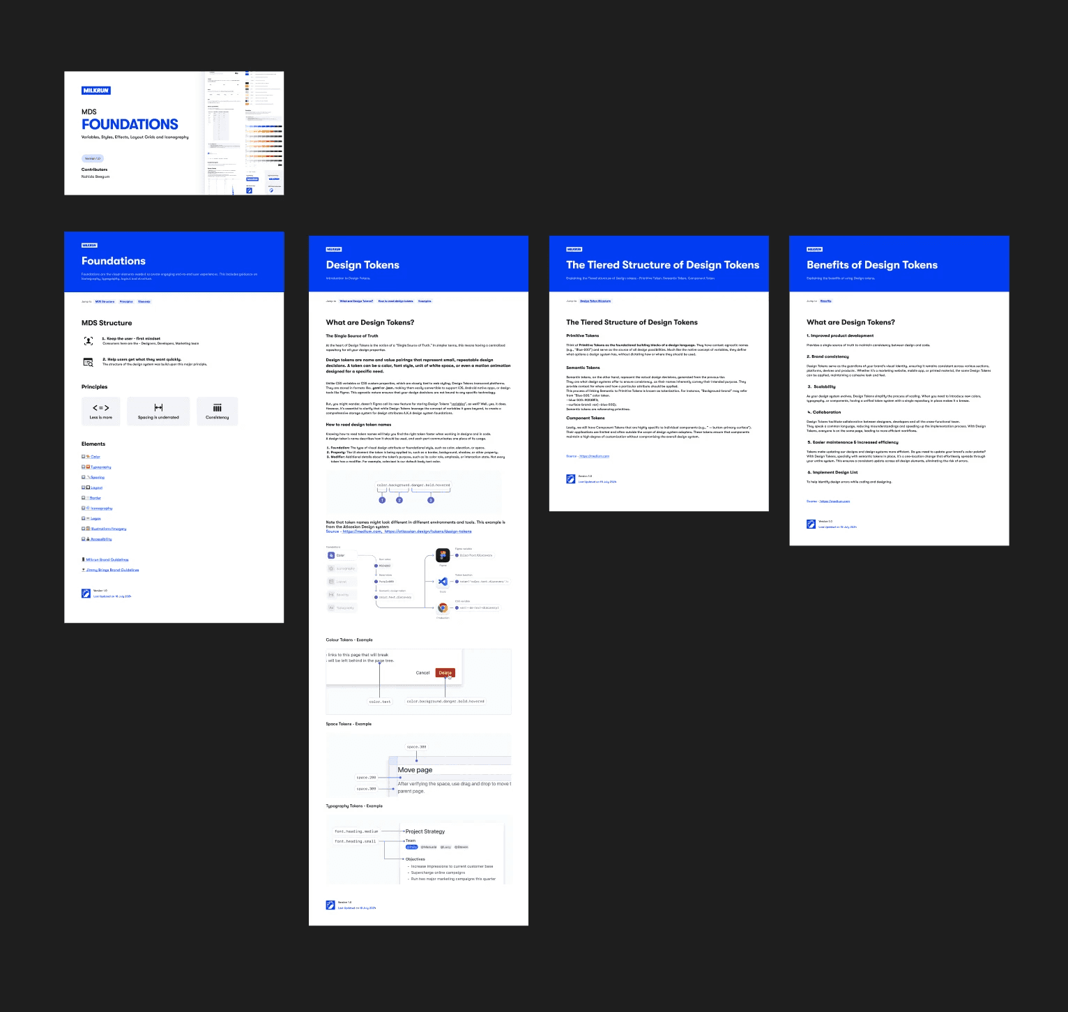
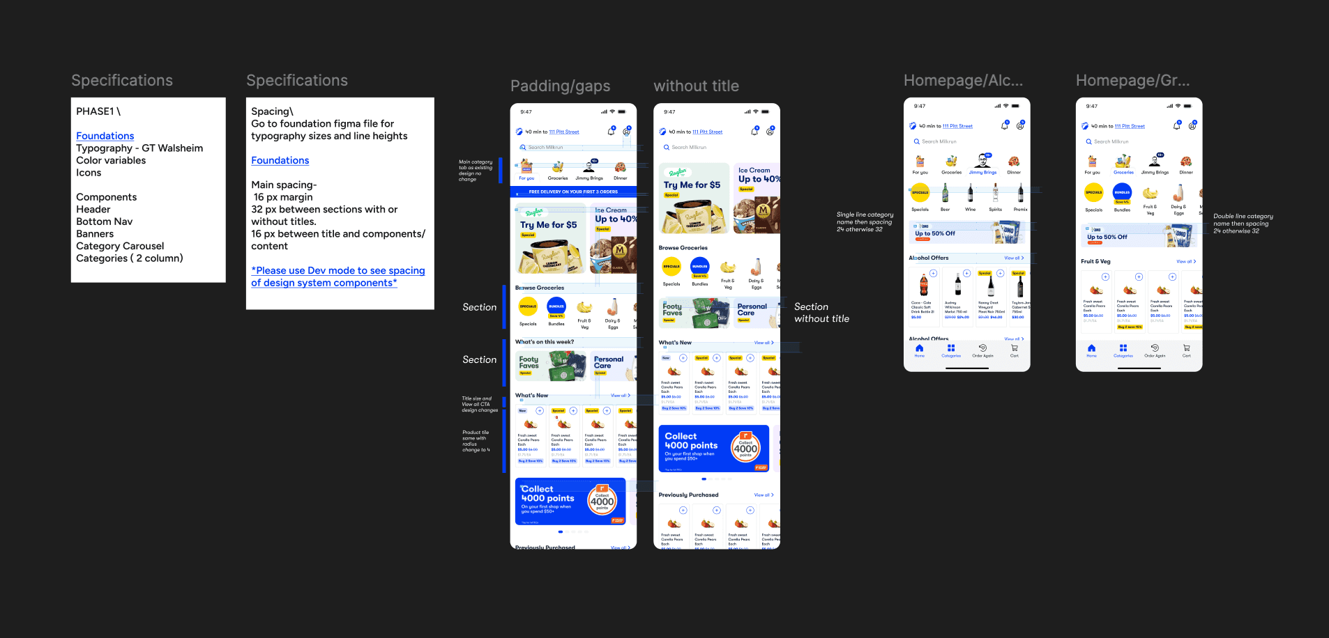
Once the redesigned screens were approved, I built the Milkrun Design System (design tokens, pill-shaped buttons, carousels and badges) behind them. Jimmy Brings was part of the brief, and later categories like Pharmacy and Homeware needed to fit in without a redesign each time.
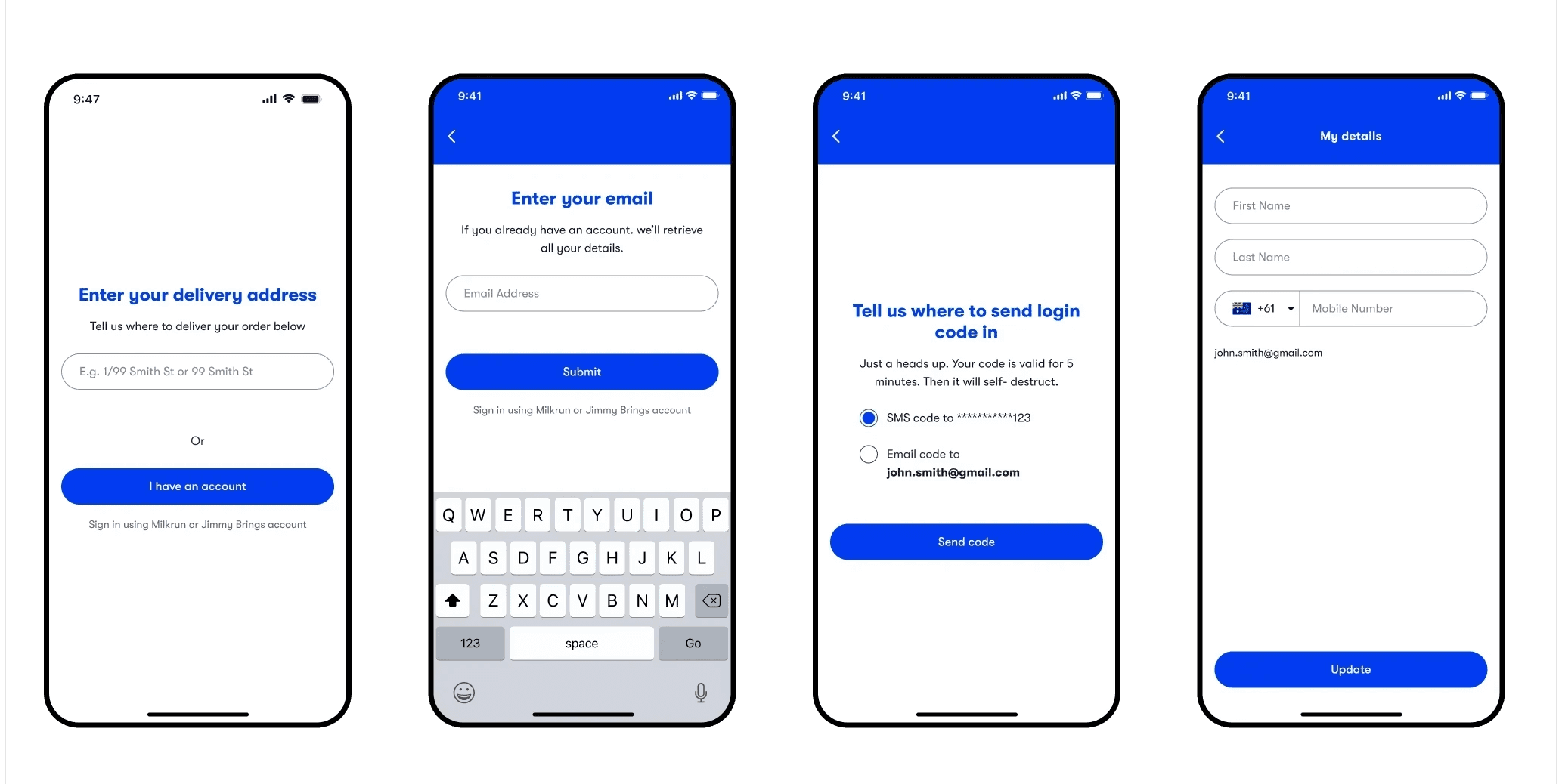
Instead of a high-risk “big bang” overhaul, I used an incremental approach based on Atomic Design: breaking the interface into its smallest units and rolling them out component by component. I started with atoms (buttons, inputs and icons), then assembled them into molecules like search bars and form fields.
Because the Jimmy Brings integration was in the project brief from the start, I designed the Liquor tab, its category cards, badges and banners in the same visual language as the rest of the refresh, so liquor felt like part of Milkrun, not a bolted-on brand. When I built the system, those pieces became standard MDS components, so engineers could reuse them and handoff stayed quick.
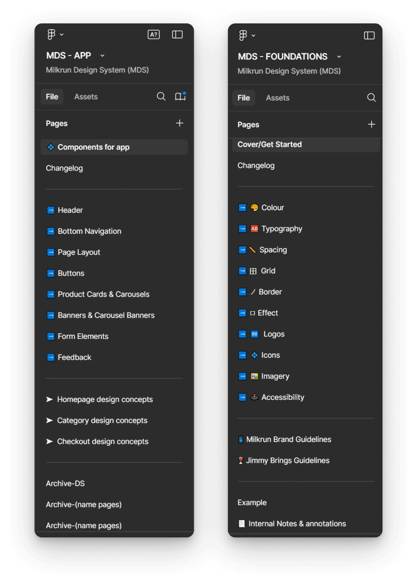
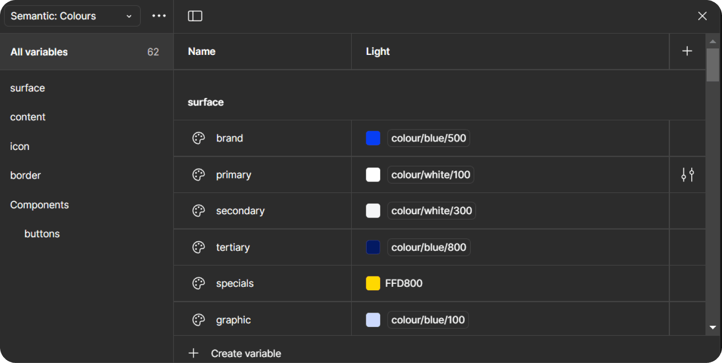
Incremental adoption let engineers migrate legacy elements at their own pace, kept existing screens stable, and let us validate each piece with real user data before scaling. I documented every token and rule in Figma so developers could adopt each piece as it shipped.
Milkrun Design System (MDS)
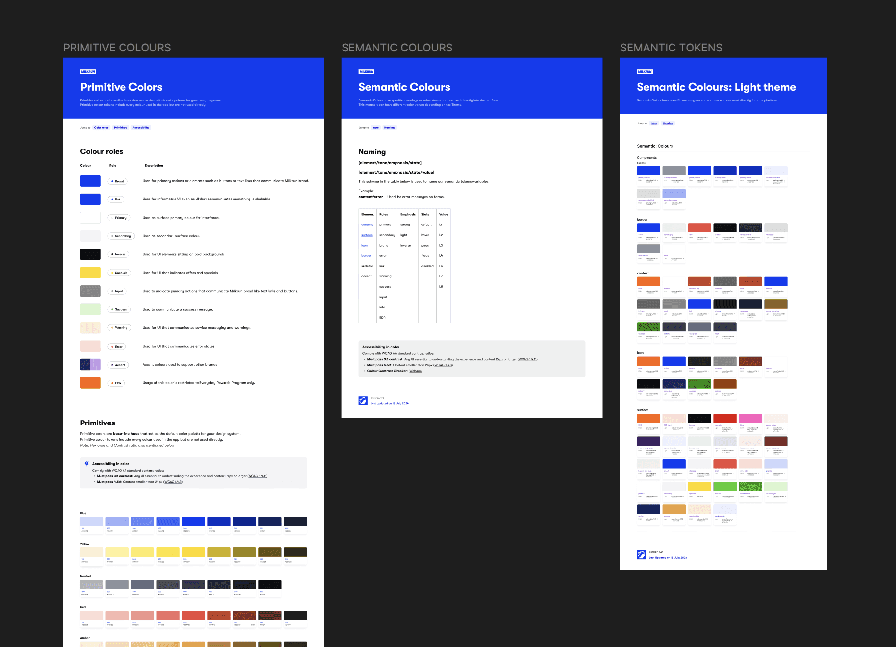
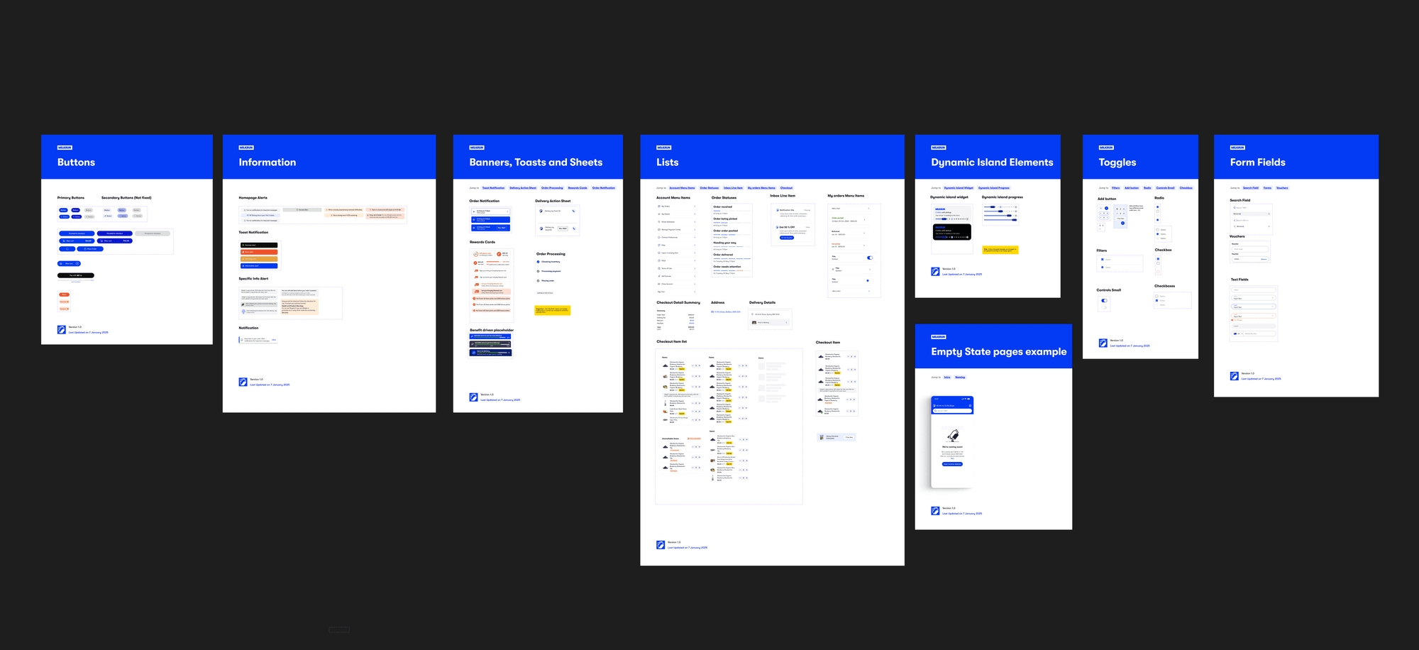
Design Guidelines / Dev Handoff
Other Refinements
Liquor tab
Categories were presented as a single undifferentiated grid, making it hard to find liquor items once Jimmy Brings was integrated into the app.
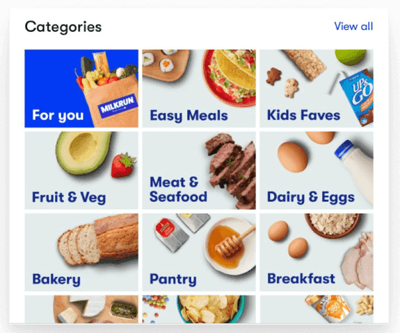
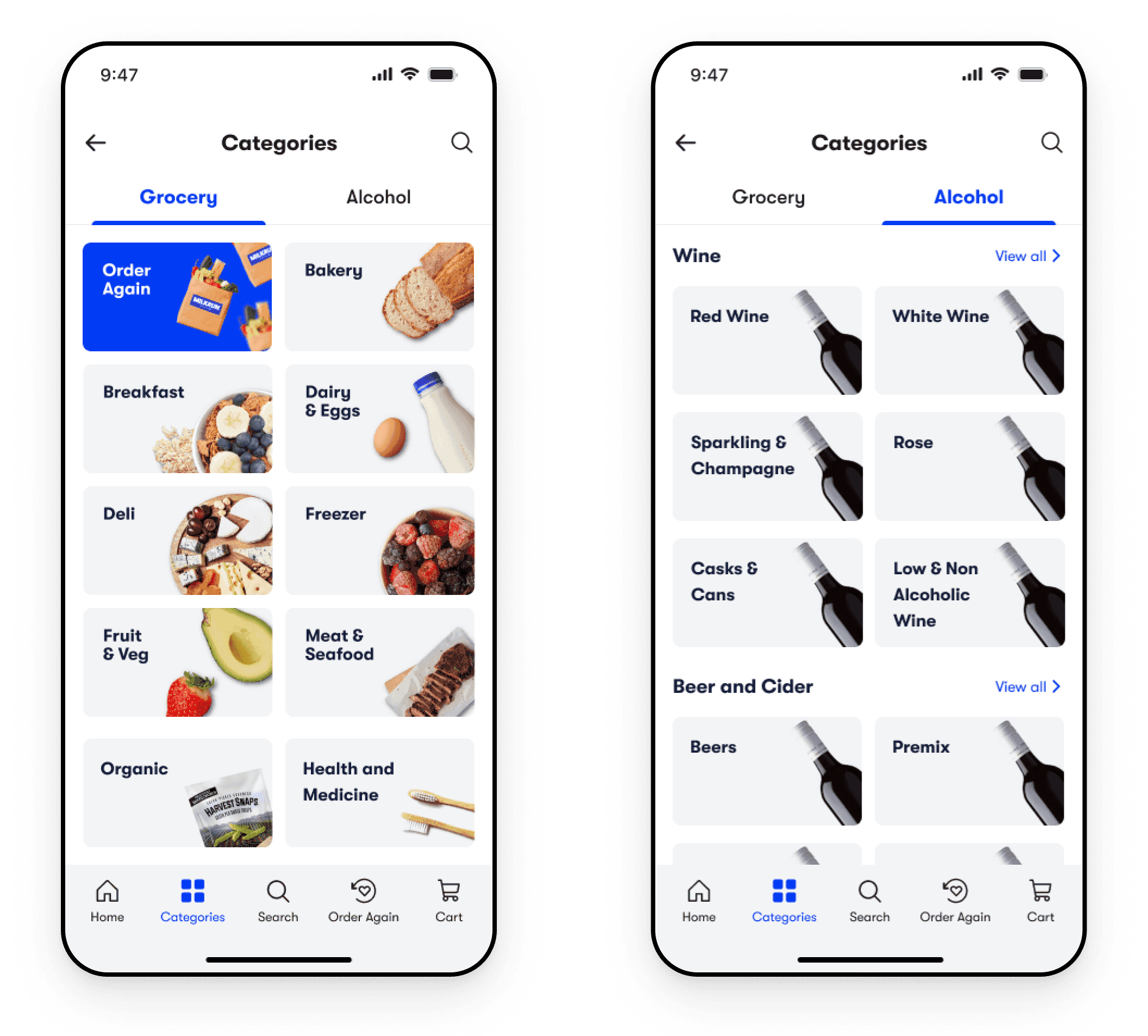
Solution: Redesigning Categories. A dedicated Liquor tab supports the Jimmy Brings integration, and category cards were redesigned for clearer scanning.
Badges, tags and warnings
Without dedicated tabs for New Offers, Specials, and Meal Time, users couldn’t quickly tell which product ecosystem they were browsing.
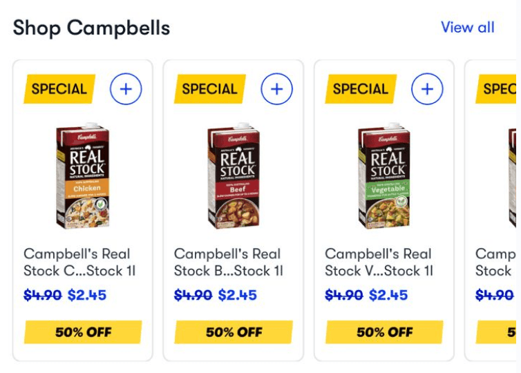
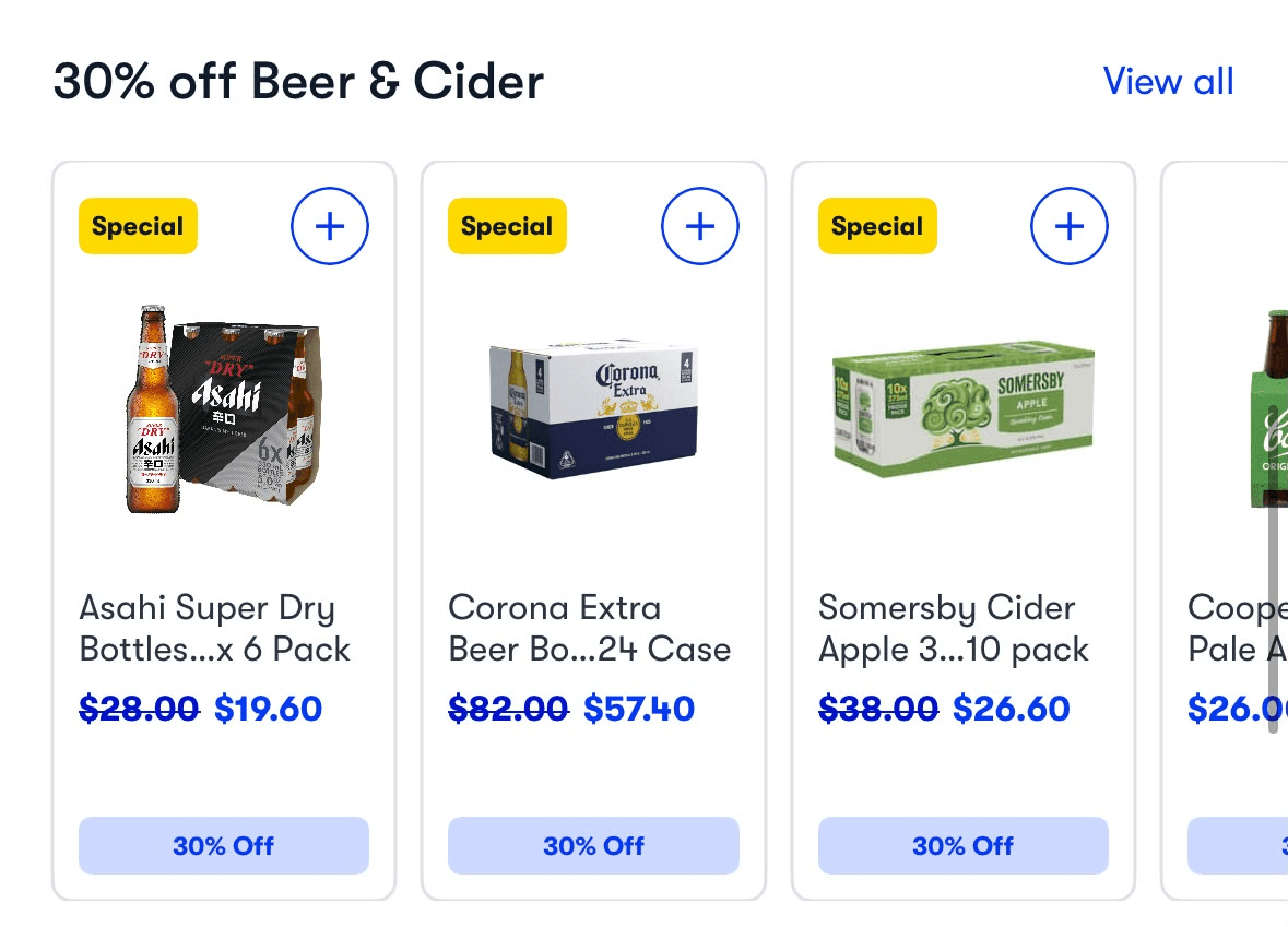
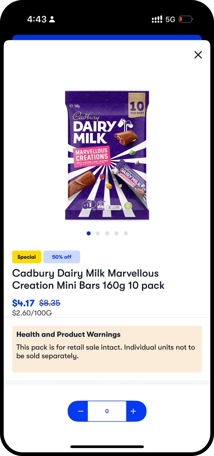
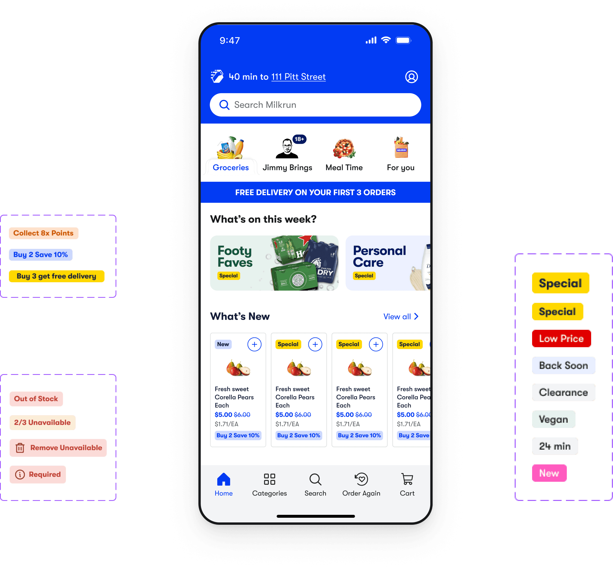
Solution: Navigation Tabs and Badges. Dedicated tabs for each product ecosystem and a consistent badge system give users quick visual cues.
How I Worked with the Team (summary)
- A Figma voting workshop let the team pick priorities from research, not preference.
- I translated the external branding team’s “Easy Peasy” identity into digital guidelines while it was still being defined.
- Once I’d defined how components like badges, tags and banners should work, I briefed the brand designers producing them. They wanted to understand why each component worked the way it did in the new brand, so I walked them through the reasoning behind every decision, such as my decision to make only tappable elements pill shaped and give everything else a smaller corner radius.
- Documenting tokens and usage rules let developers and designers adopt the system piece by piece without breaking live screens.
- Evidence-led reviews with the Founders and Head of Growth kept decisions moving.
Key Success Metrics
Successful Brand Refresh
Stayed in close, ongoing communication with the external branding team, translating their new “Easy Peasy” identity into digital guidelines and the Milkrun Design System as it was being defined. That seamless handoff let the same system extend cleanly into the Jimmy Brings liquor integration.
Key Learnings and Reflection
Evidence beats opinion.
Every change, from fewer blue backgrounds to the header search bar and the restructured homepage, answered a documented drop-off point. Moving from “I think” to “the data shows” is what moved me from executing redesigns to shaping the strategy.
Brand and usability can pull together.
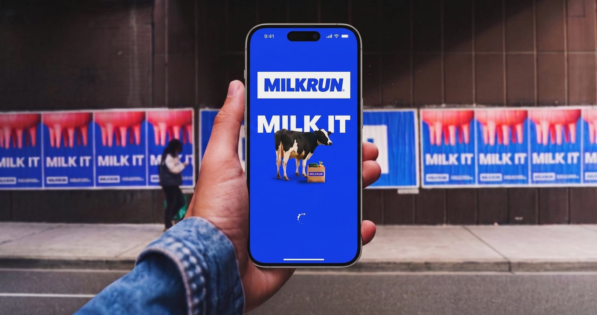
The cheeky brand voice lived in moments like the loading screen, while core flows stayed clean, so personality never got in the way of shopping.
Show the bigger picture.
I used a Home and Navigation brief to show how the system could lift the whole app, and the client extended the engagement so I could keep revamping it with their team.
Convenience grows the business.
Each change removed friction for customers and moved a metric, from retention to conversion and liquor orders.
If I did it again, I’d build AI into the workflow from day one.
The thematic analysis was already AI-assisted, but I’d go further with Claude now: synthesising research and session notes in hours instead of days, drafting component documentation and token names, and turning designs into working prototypes for stakeholder reviews. That would leave more time for the design and strategy decisions.